Zeta-SE is an engineering startup based in Besançon, specialised in vibration mitigation, offering custom solutions to companies. I worked on this project during my apprenticeship, and it was the first branding project I handled from beginning to end. The goal was to create a professional visual identity based on an old logo provided by the client.
The client wanted me to develop a professional brand that would help the company evolve. They sent me the existing logo along with some directions they had already explored.
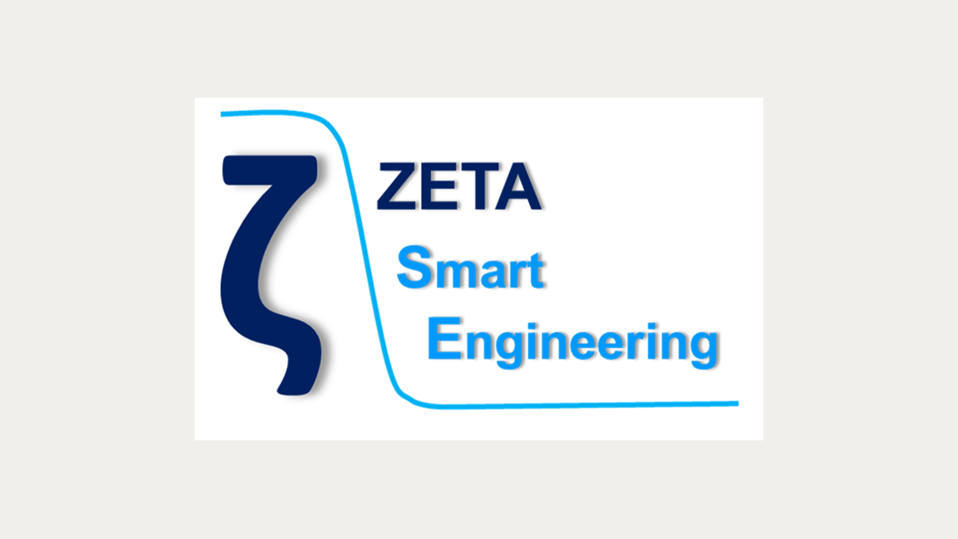
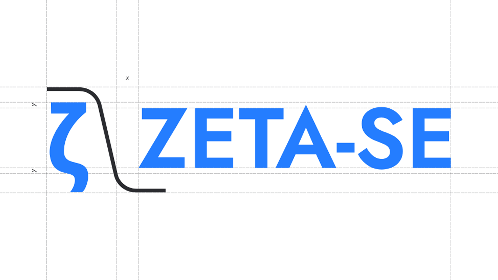
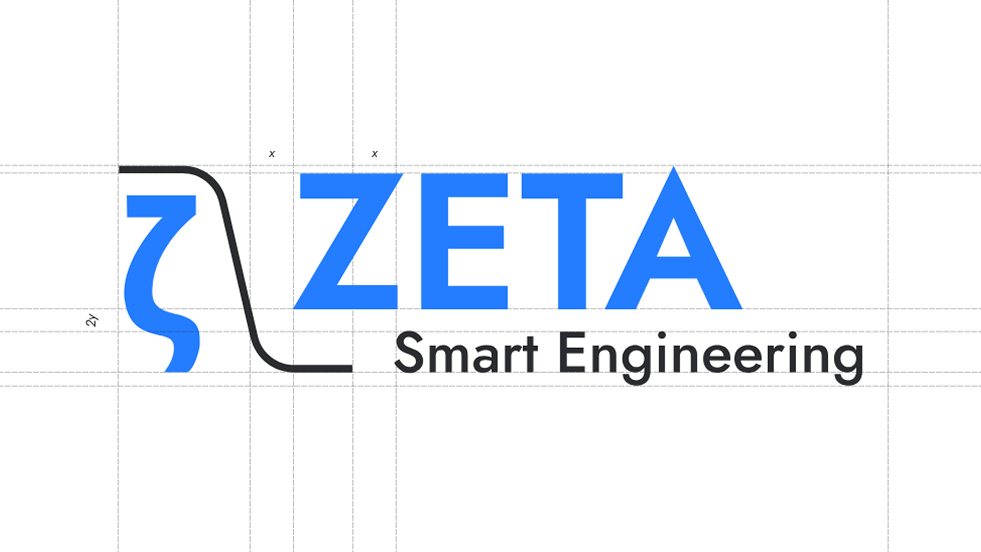
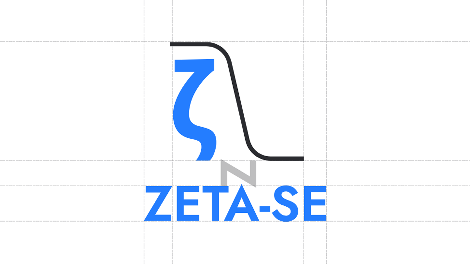
I started by analysing the existing logo, which featured a Greek letter Zeta — a symbol for damping ratio — and a curve representing low-pass filter amplitude response, both central concepts in vibration physics. The logo had heavy shadow effects applied to it, the versions with a wordmark were unbalanced, and the colour choices made the brand feel older than it was.
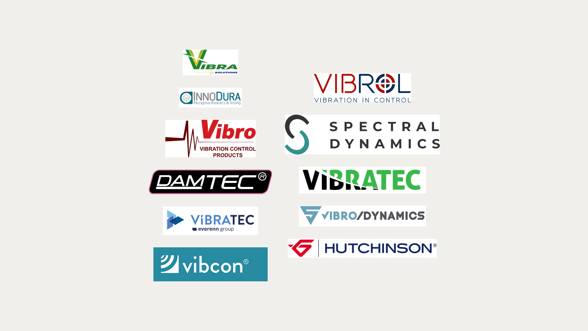
I then researched the visual identities of their competitors, noticing that most use blue and red and reference movement, vibration, and precision. The problem is that most of them look outdated. Creating an identity that respects the industry codes but looks more contemporary would give Zeta-SE a real edge.
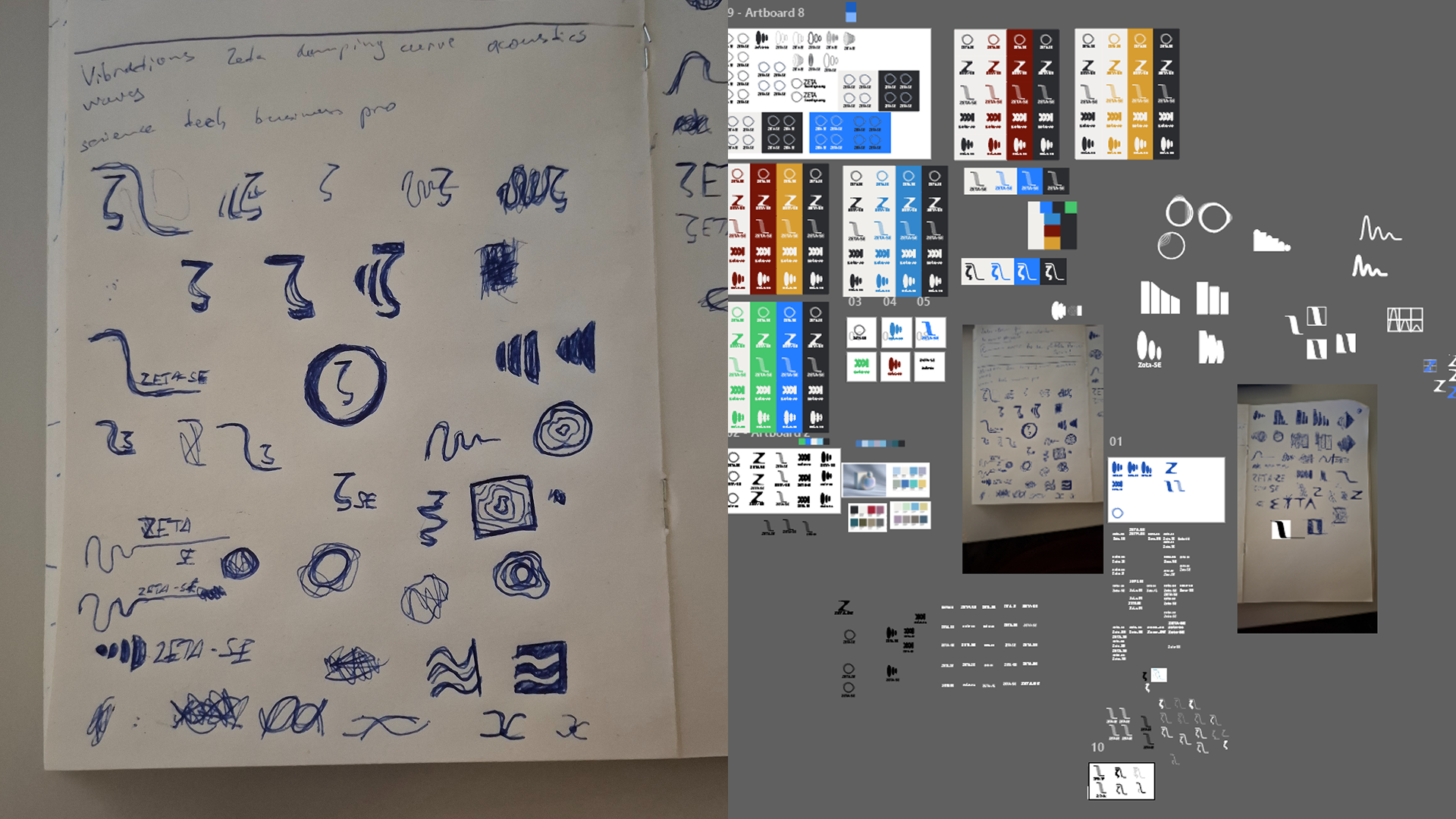
With that in mind, I moved into exploration — sketching on paper first, then refining in Illustrator.
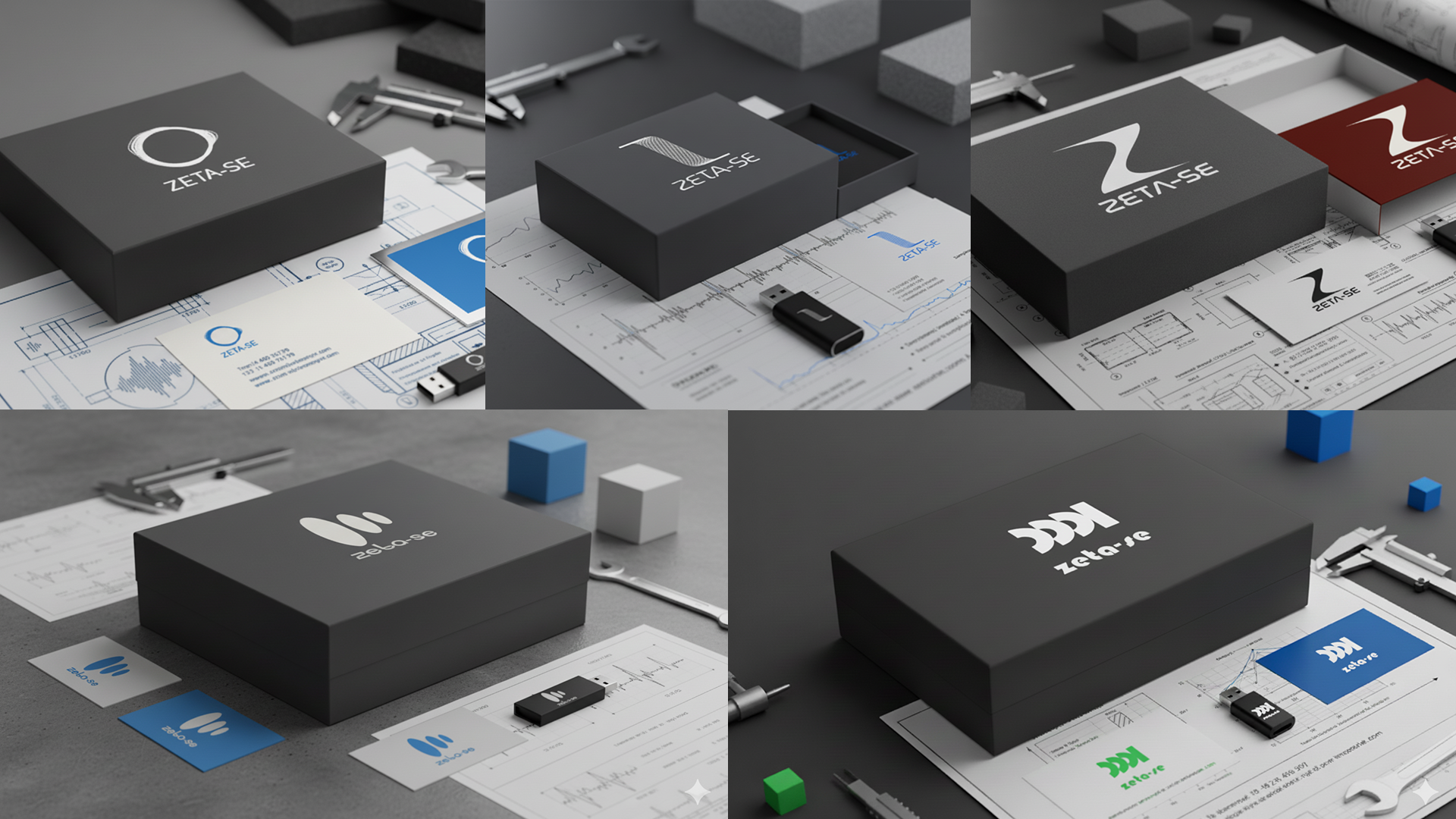
I proposed 5 logo directions to the client. Each explored a different angle: the letter Z, the Greek zeta, vibration waveforms, and damping curves.
Unfortunately, after some discussion, the client decided they wanted to keep the existing logo but give it a refreshed look.
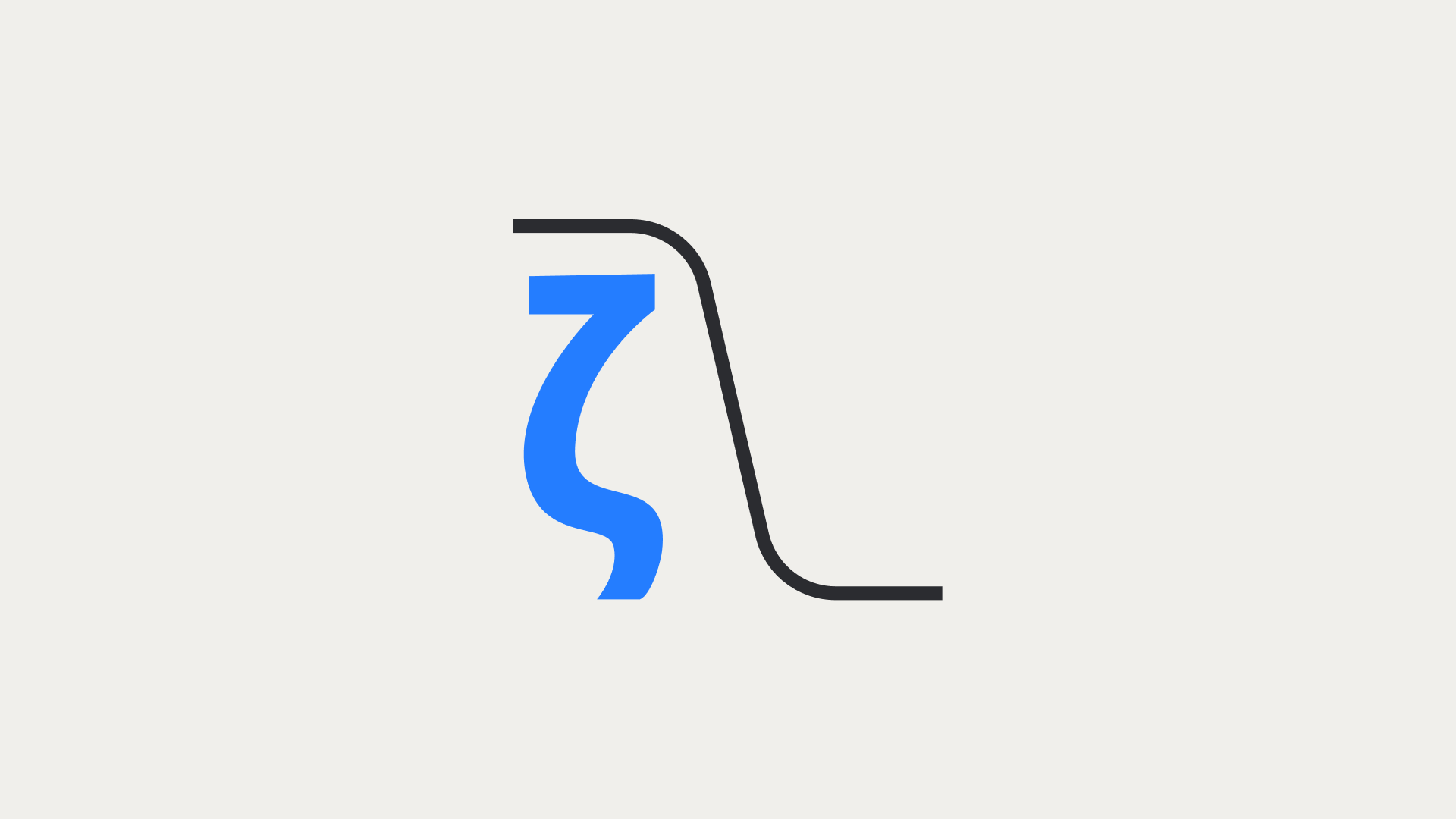
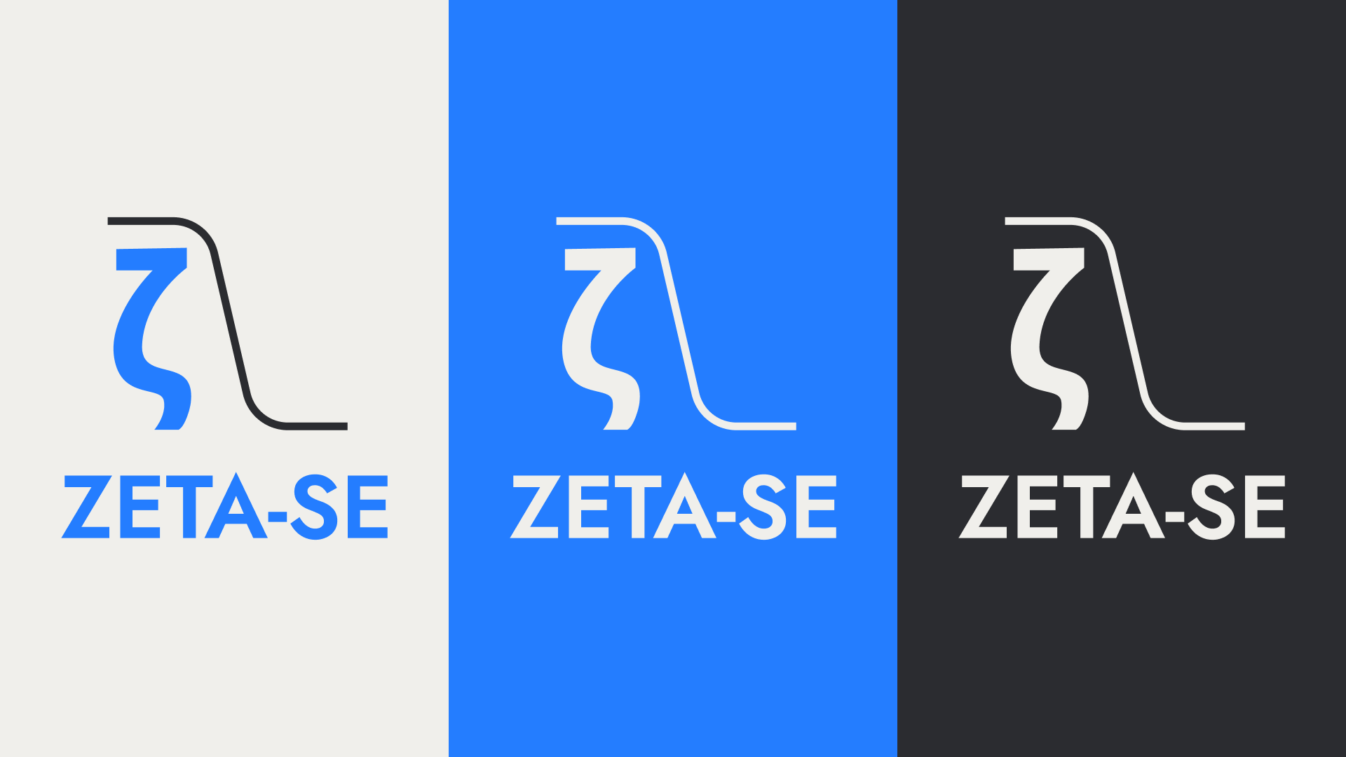
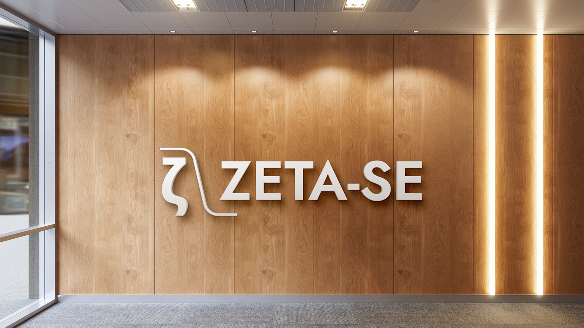
I simplified the forms and updated the colours to make it feel more modern. Since I couldn’t rework the logo further, I decided the best way to meet the brand’s goals was to focus on the identity system rather than the logo alone.
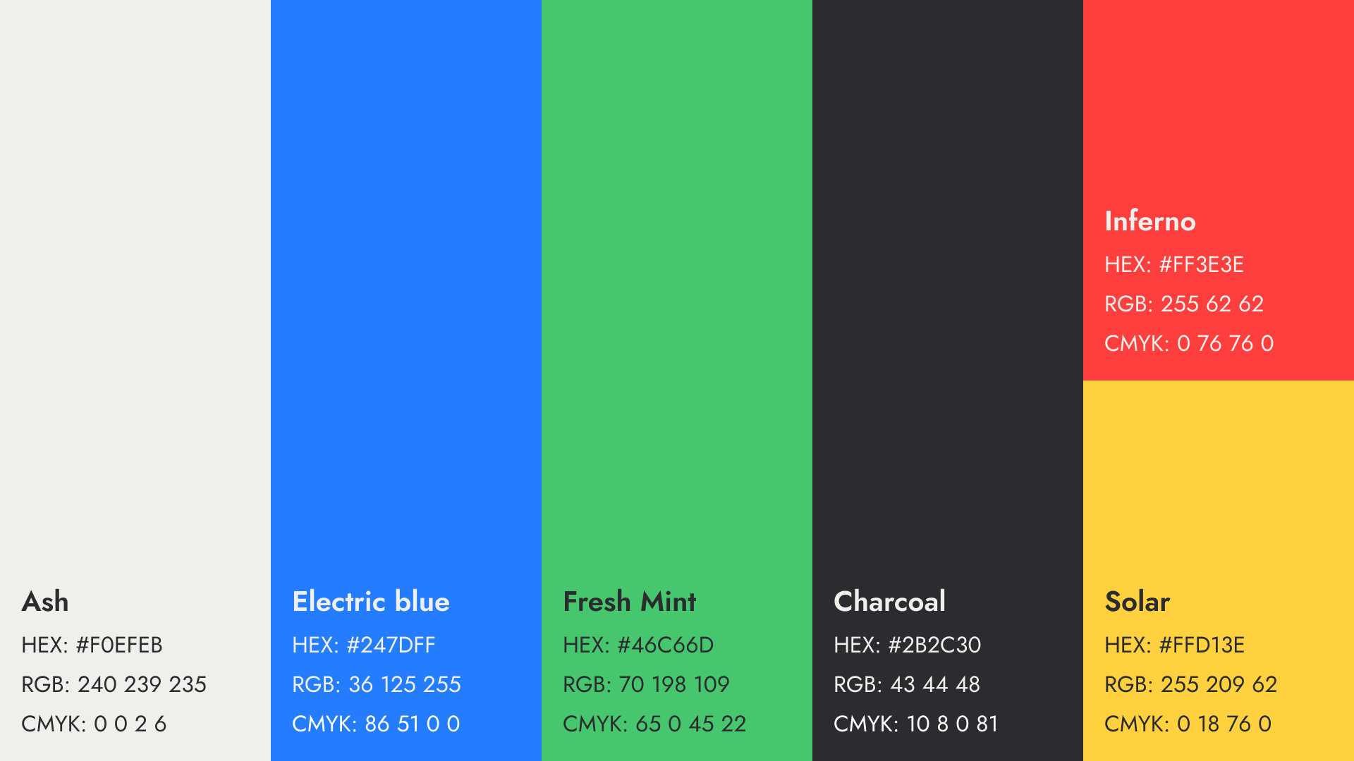
I built a brand colour palette and added a set of semantic colours intended for presentations aimed at scientific audiences.
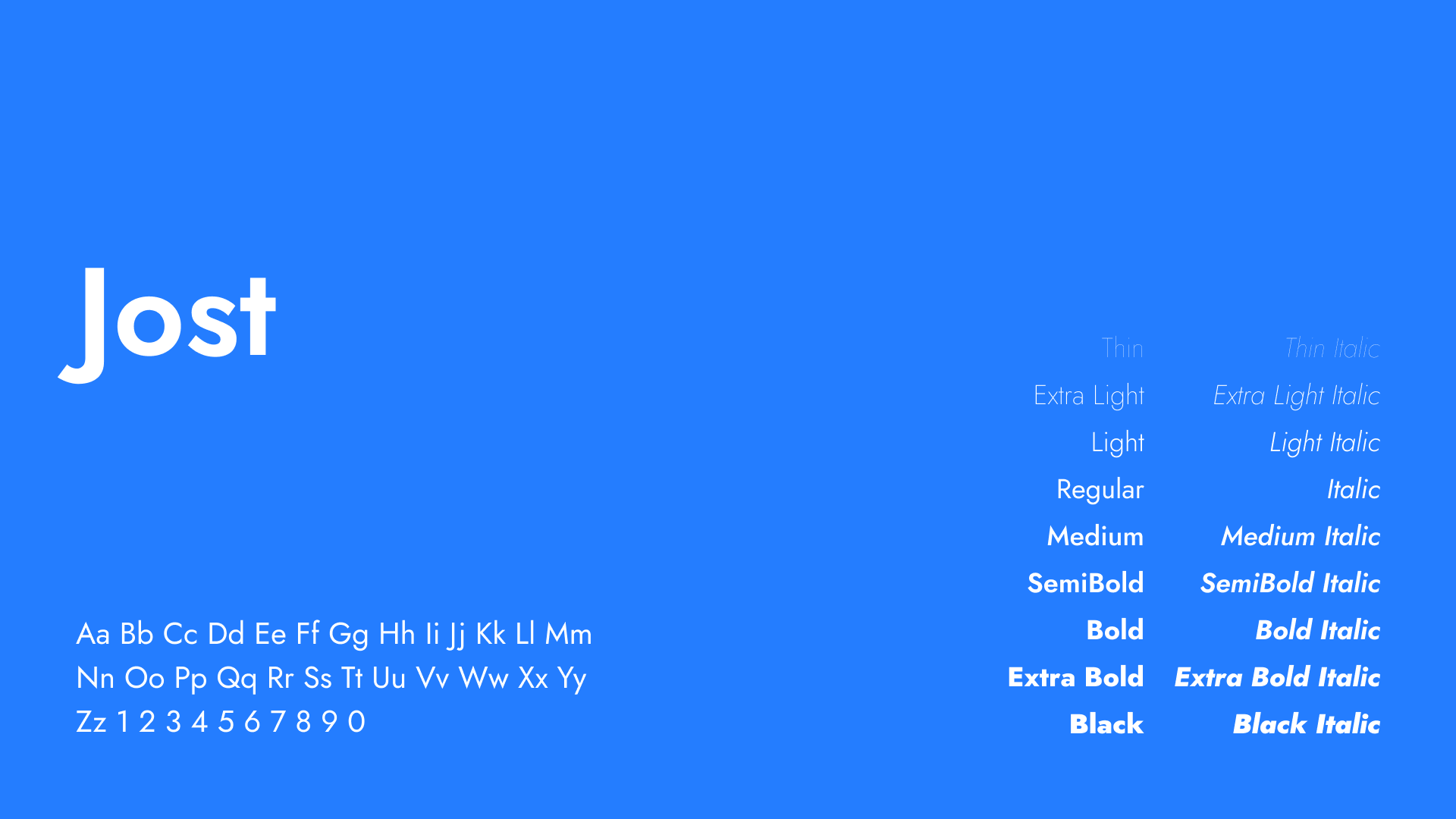
For typography, I chose Jost — a typeface that works both in the wordmark and across all communications.
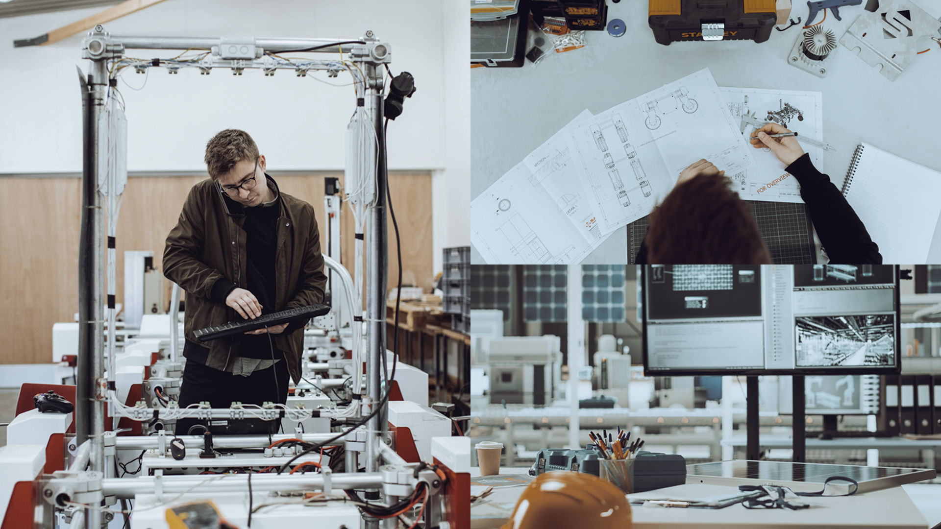
Photography in Zeta-SE’s identity focuses on technical precision in real engineering environments. Images show clean workspaces, measurement instruments, and hands-on work with advanced equipment – capturing both the rigour of the process and the people behind it. The colour palette of the photography leans cold: steel greys, clinical whites, and dark backgrounds, with occasional warm accents from natural light or amber instrument displays. Composition stays tight and purposeful — no decorative staging, no stock-photo ambiguity.
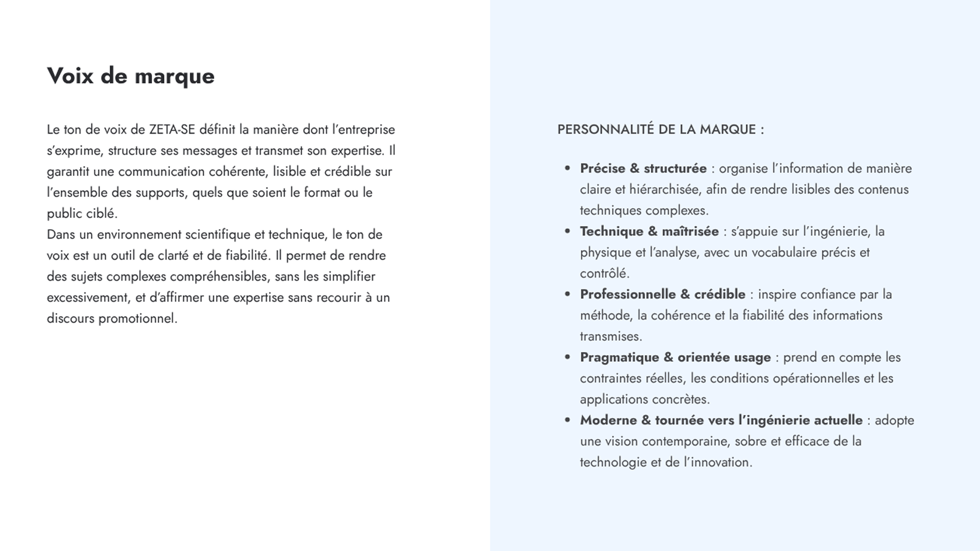
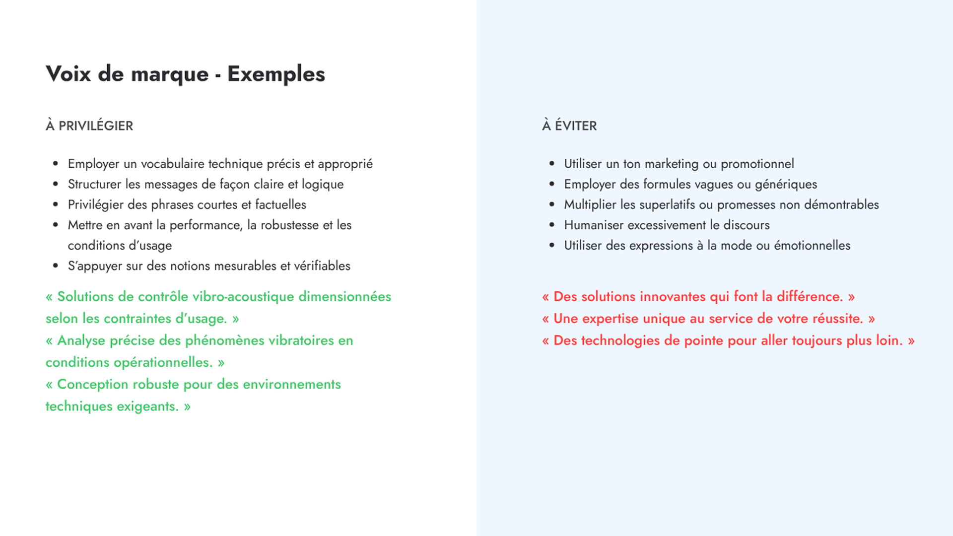
Zeta-SE’s voice is built for engineers and technical decision-makers. It’s precise, factual, and structured — complex subjects are made readable without being simplified. Copy prioritises measurable realities over claims: operational conditions, performance specs, concrete use cases. Sentences stay short. Vocabulary stays controlled. There’s no marketing inflation and no emotional register — the brand communicates like a well-written technical brief, which is exactly the kind of credibility its audience responds to.
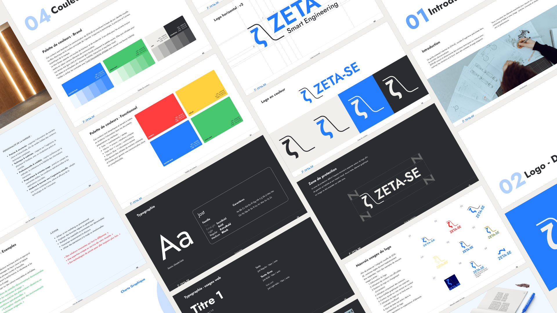
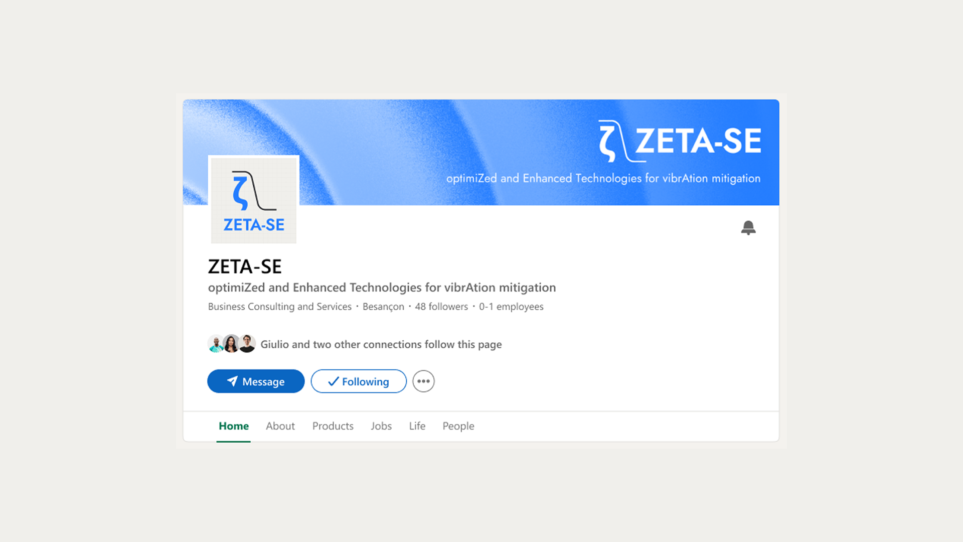
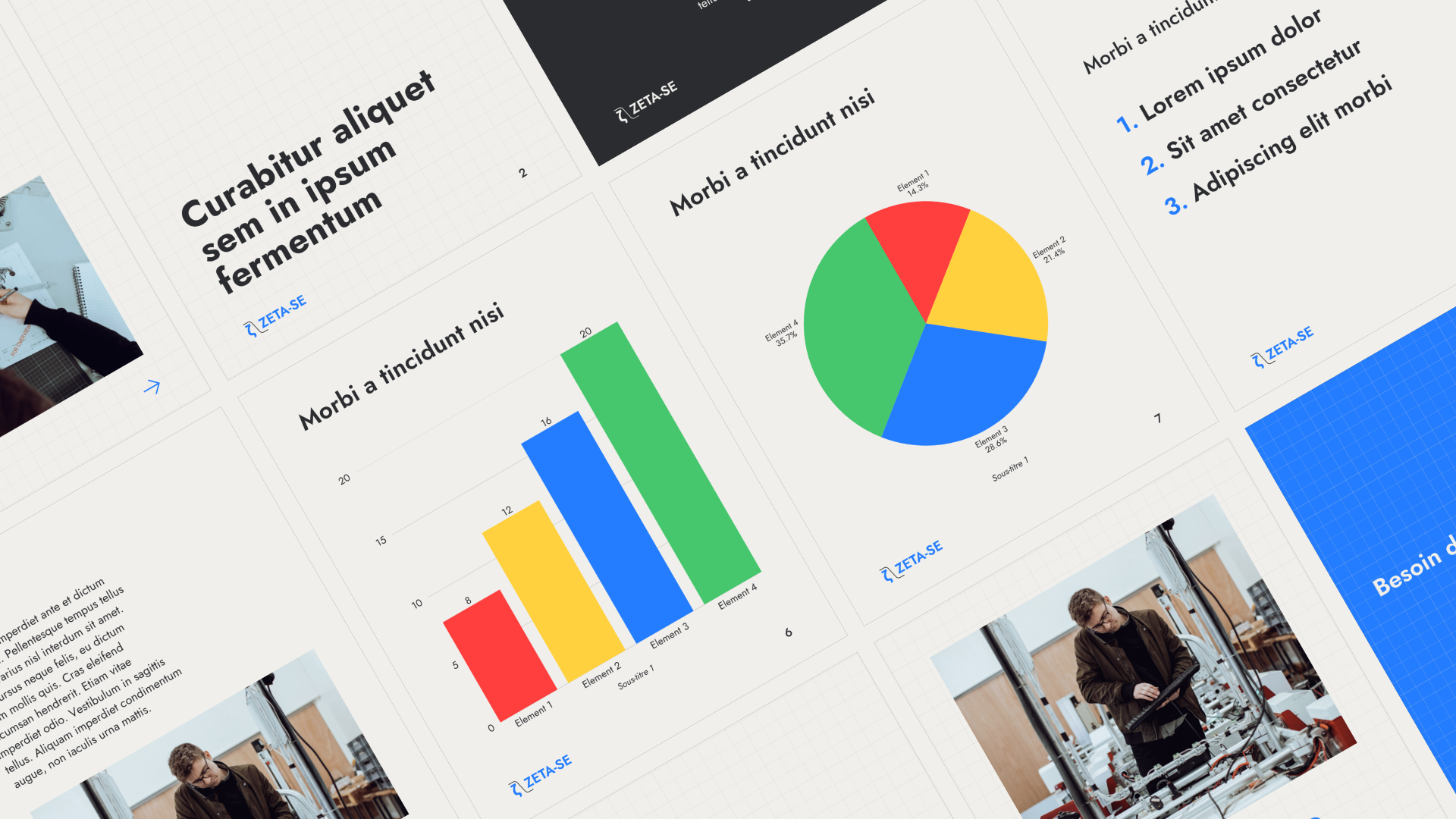
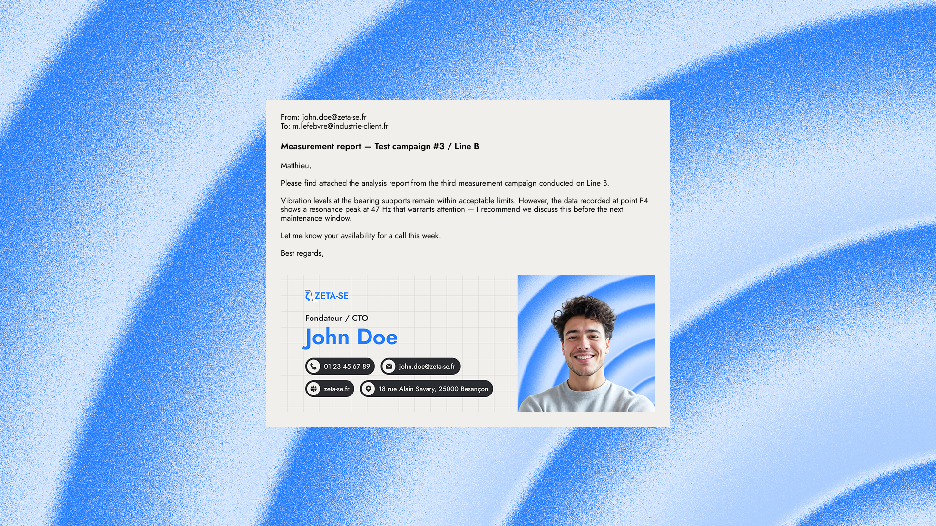
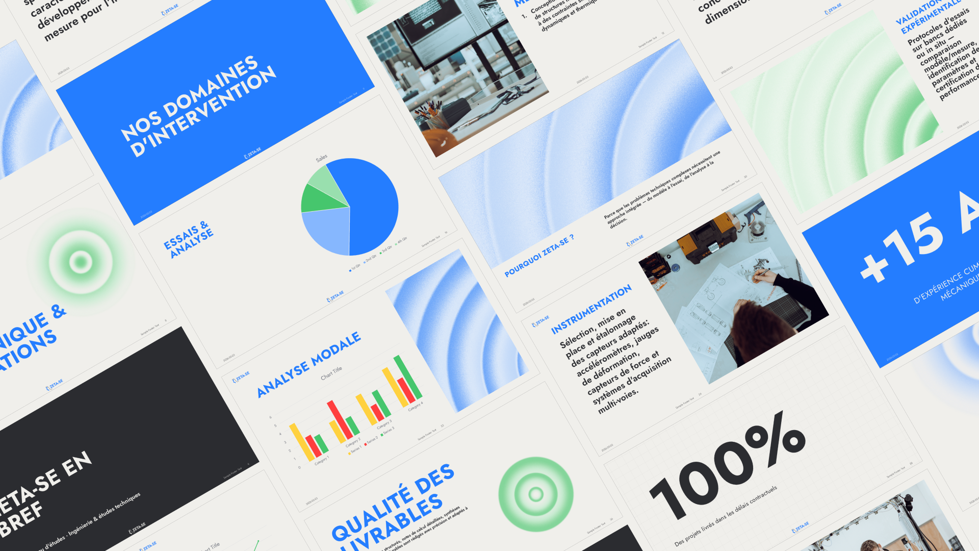
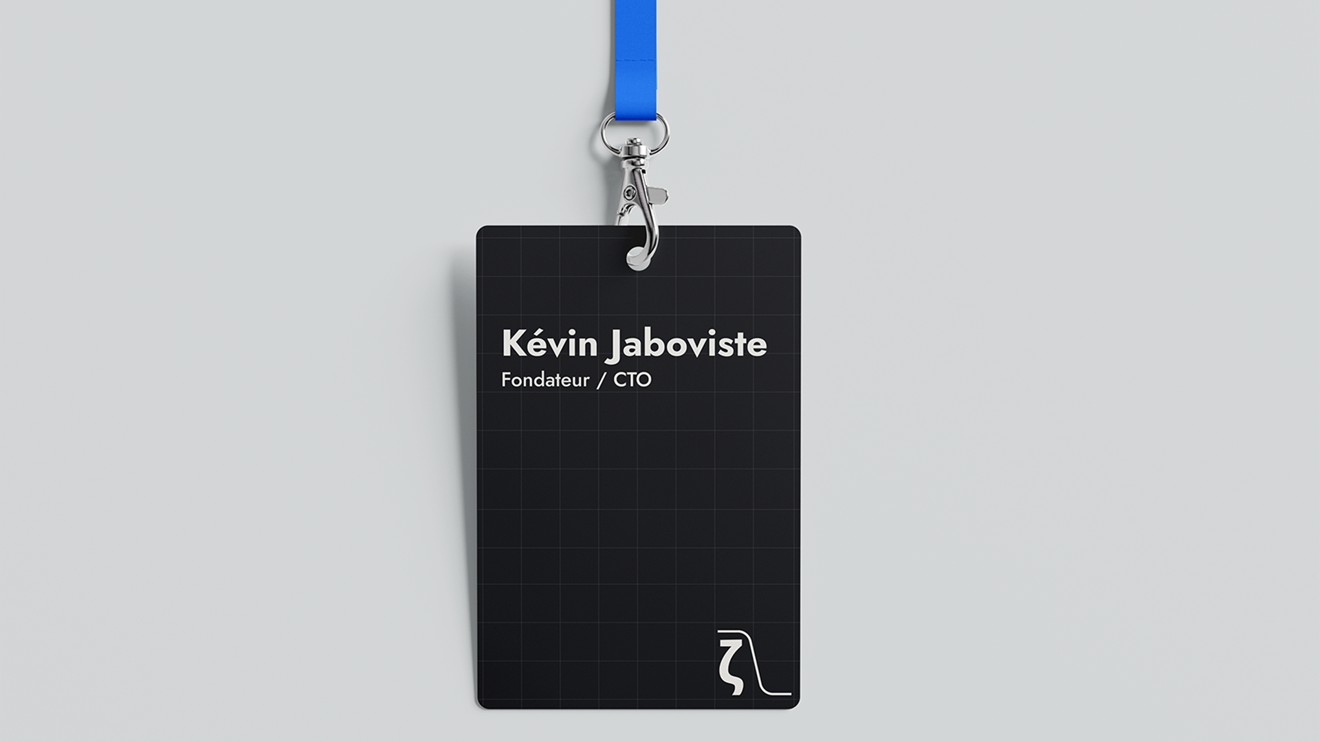
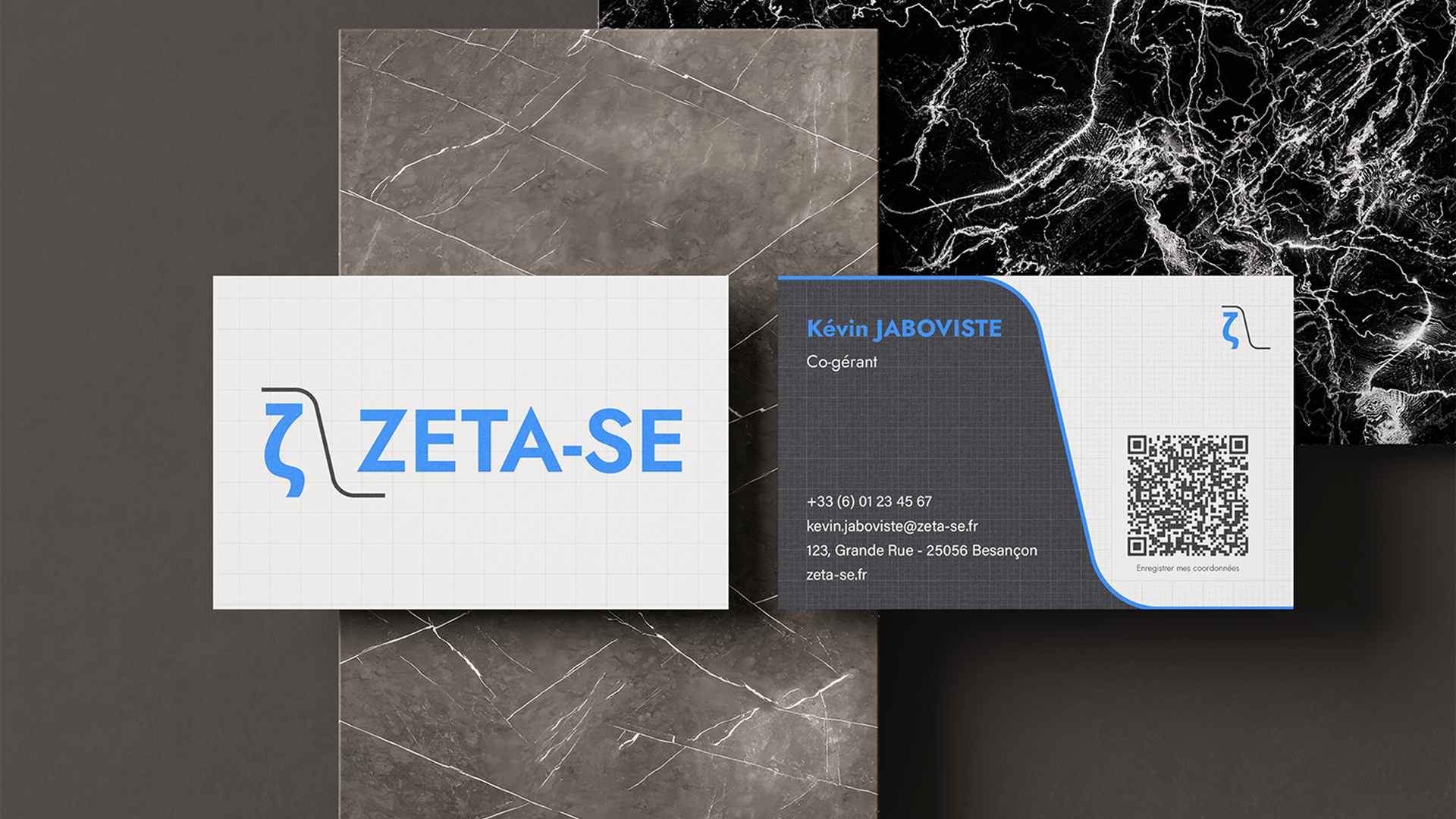
The final deliverables included logos, a brandbook, social media templates, PowerPoint templates, email signatures, and business cards.